
Overview
The FleetAdvance Driver Scorecard provides insight into an individual driver’s fueling performance and details how their performance compares with other drivers in your fleet. Key features and benefits include:
- An in-depth summary of a driver’s fueling activity
- Data that can be tied to incentive programs
- Ability to print hard copies from your browser or print as a PDF
- Transaction spend and scores by each merchant chain
- Matrixes showing specific driver performance details, such as ranking within your fleet, average number of transactions in a specified date range, average fuel score, etc.
- Dollar amount for calculated savings potential (missed opportunities)
Driver fueling behavior is the largest opportunity for reducing fuel costs. That’s why we provide the Driver Scorecard, a tool that allows you to pinpoint and address areas of improvement in the fueling behavior of each of your drivers, thus improving your entire fleet’s performance.
The Driver Scorecard is an add-on feature and can only be accessed by request. Contact a Comdata Sales Associate today to discuss pricing options!
Accessing the Driver Scorecard Card Summary
iConnectData > FleetAdvance > Analyzer
To access the Driver Scorecard, select a driver’s name from the Top Opportunities section of the Opportunity Analyzer. You can also select a driver’s name after selecting the window icon.

The Driver Scorecard contains five detailed sections that clearly outline a driver’s performance. Please note that the data displayed on the scorecard is based on the date range selected at the top of the Opportunity Analyzer page.

Card Summary
Use Card Summary to see specific details related to a driver’s transaction activity, such as total transactions, total gallons purchased, total alerts, etc.
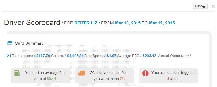
Key Points:
- The section, Of all drivers in the fleet, you were in the X%, represents the driver’s rank within your fleet. The higher the percentage, the higher the rank. This number is based on the driver’s average fuel score.
- The Average PPG is a roundup of the actual number for more accurate representation. Note that this also takes negotiated discounts into account.
- Potential Savings is the total amount your driver could have saved by fueling at lower-priced locations.
- Select the print icon in the top-right corner to print the scorecard from your browser or to print it as a PDF.
Score Metrics
Score Metrics provides a detailed view of your driver’s transaction scores and how they compare to other scores within your fleet. Use this section to identify scores that are below the fleet’s average.

The line graph displays the score of each transaction within the selected date range. The blue line represents all transactions within your fleet, while the black line represents the transactions for the driver you’re viewing. Hover your cursor over a dot on either line to view a score.

The circle graph displays the percentage of transactions that fall within the FleetAdvance score ranges (above 90, 70-90, and below 70). Hover your cursor over a section of the graph to see the total number of transactions.

Performance
This section further details the driver’s performance in comparison to other drivers in terms of average score, overall rank, and total number of alerts and transactions. Use this section to gain a better understanding of your driver’s fleet ranking.

Key Point:
The blue bar represents the fleet’s average regarding score, rank, alerts, and transactions. The gas pumps represent where your driver falls in relation to the average. For example, if your driver’s average score is below the fleet’s average, the far left gas pump will be shorter than the blue line. If the driver fuels more than the fleet’s average number of transactions, the gas pump on the far right will be taller than the blue line.
Saving Potential
Saving Potential displays the number of transactions that were priced higher than the lowest prices available. The dollar amount represents the total amount your driver could have saved by fueling at alternative locations. For example, the image below tells us that this specific driver overspent $203.12 by going to eighteen higher-priced locations.
Reminder: The data in the scorecard is based on the date range selected in the Opportunity Analyzer. We recommend a monthly view for each scorecard.

Fuel Locations
Fuel Locations breaks down the driver’s fuel score and spend by merchant chain. The total amount spent and the score for each transaction at each chain are combined to display the averages. For example, in the image below, if eight transactions occurred at Pilot locations, the total of those transactions equals $349.88, and the scores for those transactions average a 61.98 (62 rounded up).
Hover your cursor over a pie chart section to see the total number of transactions for each merchant chain.


The pie graph initially displays the primary chains (Loves, Pilot, TA, etc.) based on the Fleet’s fueling frequency. However, if the driver fueled at non-primary chains, they will be designated by the section, “Others”. This section contains the percentage of transactions that took place at other locations and their combined average spend and score.
Summary
The Driver Scorecard not only increases transparency of fueling activity but also promotes communication. We encourage you to use this open communication to connect with drivers on an individual level and help them understand how their performance impacts the entire fleet. Use the detailed features of the Scorecard as a basis for communication and to drive fueling expectations.
Contact your Comdata Sales Associate today to discuss how you can make the Driver Scorecard a valuable asset for you and your fleet.